Manual Scripts

As an avid journaller, the task of writing a 500-word reflection by hand felt almost natural to me. I say “almost natural” because despite having written in paper journals for years, I switched to digital journaling almost a decade ago and have lost some of my ease with handwriting. As a result, I found myself often missing letters and having to carefully print them in afterwards, at one point also having to cross out a word and rewrite it entirely.
As I wrote this journal-like entry by hand, I realized that some of the historical changes that came about with the spread of mechanical writing were also mirrored in my own life with my shift from handwritten journaling to mechanized journaling – most notably, my ability to use my journals as reference documents. In the same way that mechanized and mass-produced writing allowed us to have multiple editions of textbooks that build on each other, with indices and tables of contents that allow us to find content easily, my digitized journals allow me to easily look back on past events when I’m reflecting on my life. If I’m planning next steps for my career, for example, and I’m curious how I felt when I started my current job, it’s fairly simple to do a Mac spotlight search for the name of my employer and instantly call up every mention of them in my digital journals, offering me a clear window into my own personal history that I would not have available to me with handwritten journals. While I find that both handwritten and mechanized journaling allow me similar opportunities for reflection, these additional affordances of mechanized journaling fundamentally change the process by allowing me to use my journals in new ways.

Potato Printing

I certainly haven’t laughed on any of our weekly tasks as much as I did when I pulled up my first potato-stamp print of the word “lucky” to see that the letters and the entire word were embarrassingly backwards. I had carefully drafted an arrangement of the letters in a sketch on paper before transferring to the potato, and then I painstakingly cut out the stamp, experimenting with several different tools to get my desired level of precision, and then, boom, it was backwards! So I dug back into the other half of the potato to make a new stamp and struggled to draw the letters backwards in a clean arrangement.

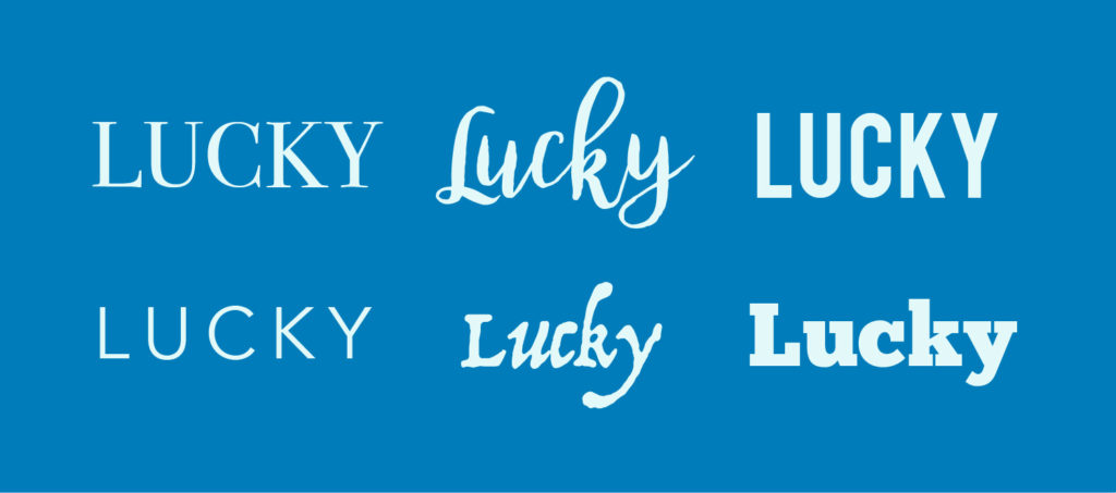
The K and the Y ended up a little too far apart, and I found myself desperately wishing I could easily “kern” the letters like I do in my work as a graphic designer with a simple Option + ← key command in any of my Adobe Creative Cloud design apps.
I saw in this moment how much I take for granted the incredible precision I have available to me when styling type, from the thousands of typefaces I have to choose from to the easy simplicity of just nudging a simple letter a couple pixels closer to its neighbour. And I realized while doing this task that while the mechanization of type has allowed us to record and disseminate information to the masses, it has also allowed us to meld customized visual communication with our written language. We can now communicate not only through written words but also through the customized styling of those written words, which gives all of our written communication the opportunity to say even more.
3 replies on “Task 4: Manual Scripts and Potato Printing”
Anne, I really enjoy reading your reflections to our weekly tasks. I like the human element in your stamp: the way that the letters are too close together. As a graphic artist, would you say that you can tell the difference between something that’s been digitally created, or at least digitally manipulated compared to manually created only? I’m not a digital artist so I don’t know if this is the case, but it seems like a lot of digital brushes that artists use are meant to mimic the analogue counterpart. What do you think it is about maintaining that analogue quality?
Hi Deirdre! It’s becoming increasingly difficult to tell if something is created digitally or through analogue media, particularly over the last five years as digital illustration apps get better and better at replicating traditional art media. You can now use apps like Procreate or Adobe Fresco on an iPad to create graphics that look almost identical to real charcoal, oil paint, pencil, and so on. For me, the only time I can really tell if something is digital is if there are multiple shapes that are exactly the same – for example, if a word has two L’s in it, you can tell it’s digital if the two L’s look identical.
Anne, firstly I am so impressed with your journalling, what a wonderful bank of information you have about yourself. On the potato stamp I have to admit I almost did the same thing as you. I caught myself after having printed on my potato and before cutting it out, realizing at the last minute that it would indeed come out backwards! You used all caps to write your word, which I wish I had done, the lowercase letters, especially those that are curved, are quite a challenge. I agree with you that the mobility that digital media gives us (ability to “kern” letters together) is something we sometimes take for granted. I am happy to live in a digital world, but I do enjoy some of these analogue tasks, the potato stamping was fun!